 Skip to content
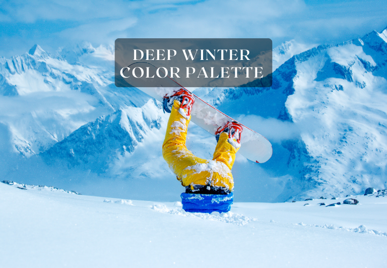
Deep Winter Color Palette: 40+ Stunning Combinations
Get 40+ deep winter color palette ideas and combinations for your home or design projects at ColorMagical.com for $9.99


Deep Winter Color Palette: 40+ Stunning Combinations
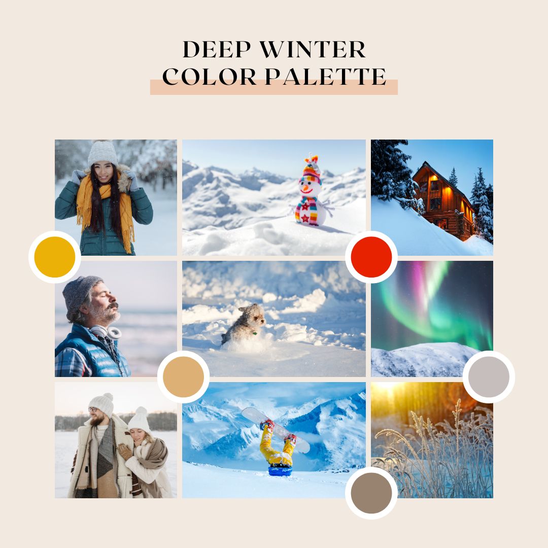
Discover the magic of the Deep Winter Color Palette, a collection of 40+ stunning color combinations that can elevate your home decor, design projects, or personal style. Available for just $9.99 on ColorMagical.com, this comprehensive palette collection provides a wealth of inspiration and practical color schemes to enhance your creative endeavors.

The Deep Winter Color Palette is unique in its ability to evoke a sense of calm and sophistication, making it perfect for various design contexts. By incorporating these winter colors into your projects, you can create visually appealing and harmonious designs that captivate your audience.
What Makes the Deep Winter Color Palette Unique
Characterized by rich, intense hues with cool undertones, the Deep Winter Color Palette is a unique and captivating aesthetic. This palette is distinguished by its bold and vibrant winter color combinations that can add depth and elegance to various design projects.
Characteristics of Deep Winter Colors
The Deep Winter Color Palette is defined by its specific color temperature and intensity. These colors are typically cool, often leaning towards blue or purple undertones, which gives them a distinctive appearance.
Color Temperature and Intensity
Deep Winter colors are known for their high intensity and cool temperature. This combination creates a dramatic and luxurious visual effect, making these colors ideal for designs that require a strong impact.
Signature Hues and Undertones
The signature hues of the Deep Winter Color Palette include deep blues, purples, and cool neutrals. These colors often have blue or purple undertones, which differentiate them from warmer color palettes.
How Deep Winter Differs from Other Seasonal Palettes
Understanding how Deep Winter differs from other seasonal palettes is crucial for effective design application. Two key comparisons are with Dark Winter and Cool Winter palettes.
Comparison with Dark Winter
While both Deep Winter and Dark Winter palettes feature cool tones, the key difference lies in their intensity and brightness. Dark Winter colors tend to be darker and more muted, whereas Deep Winter colors are bold and vibrant.

Cool Winter and Deep Winter share some similarities, but they are distinct in their undertones. Cool Winter may have more neutral or pink undertones, whereas Deep Winter is characterized by its distinctly cool, often blue or purple undertones.
By understanding these differences, designers can choose the most appropriate palette for their projects, ensuring a cohesive and impactful visual identity.
The Psychology Behind Deep Winter Colors
By delving into the psychology of Deep Winter colors, designers can unlock new ways to create emotionally engaging and impactful designs. The Deep Winter Color Palette is renowned for its rich, deep tones that evoke a strong emotional response.
Emotional Impact of Deep Winter Hues
Deep Winter colors have a profound emotional impact, often associated with feelings of luxury and sophistication. These colors can create a sense of drama and depth, making them ideal for high-end branding and design projects.
Creating Mood and Atmosphere with Rich Tones
The rich tones of the Deep Winter palette are instrumental in crafting a specific mood and atmosphere. They can add a layer of complexity and emotion to designs.
Sophistication and Elegance
Deep Winter colors exude sophistication and elegance, making them perfect for luxury branding.
Drama and Depth in Design
These colors also bring drama and depth to designs, captivating the viewer’s attention.
| Color | Emotional Impact | Design Application |
| Deep Navy | Sophistication, Trust | Luxury Branding, Corporate |
| Rich Charcoal | Elegance, Power | High-End Fashion, Editorial |
| Dark Berry | Drama, Luxury | Premium Packaging, Special Editions |

Exploring Our Deep Winter Color Palette Collection
With over 40 unique palettes, our Deep Winter Color Palette Collection offers a diverse range of options to suit any design need. Whether you’re working on a graphic design project, planning your wardrobe, or decorating your home, our collection provides the perfect color combinations to inspire your creativity.
Classic Deep Winter Color Combinations
Classic Deep Winter color combinations are timeless and elegant. These palettes often feature rich, bold hues that evoke a sense of luxury and sophistication.
Jewel Tones and Complementary Pairs
Jewel tones are a hallmark of the Deep Winter color palette. Some standout combinations include:
- Emerald green paired with navy blue for a dramatic look
- Ruby red complemented by charcoal grey for a bold statement
- Sapphire blue matched with platinum silver for a luxurious feel
Monochromatic Deep Winter Schemes
Monochromatic schemes offer a cohesive and harmonious approach to using Deep Winter colors. By varying the shades and tones of a single color, you can create a sophisticated and elegant design.
Contemporary Deep Winter Palettes
For those looking for a more modern take on Deep Winter colors, our collection includes contemporary palettes that blend traditional Deep Winter hues with fresh, modern twists.
Unexpected Deep Winter Color Pairings
Sometimes, the most interesting designs come from unexpected color pairings. Our collection includes unique Deep Winter color combinations that will add a creative twist to your projects. For example, pairing deep plum with frosty blue creates a captivating contrast that’s both modern and sophisticated.
These diverse palettes demonstrate the versatility of the Deep Winter color scheme, offering something for every design style and preference.
Interior Design Applications for Deep Winter Color Schemes
Deep Winter colors provide a rich and dramatic backdrop for interior design projects. By incorporating these hues into your color schemes, you can create sophisticated and inviting spaces that exude luxury and elegance.
Living Room and Common Areas
The living room is often the heart of the home, and applying Deep Winter color schemes here can make a significant impact. Wall colors and accent pieces play a crucial role in setting the tone for the space.
Wall Colors and Accent Pieces
Using Deep Winter colors on walls can create a dramatic atmosphere. Consider pairing deep blues or purples with metallic accents to add a touch of glamour. Accent pieces such as throw pillows, rugs, and vases in complementary Deep Winter hues can further enhance the space.
Coordinating furniture and textiles in Deep Winter colors can add depth and visual interest to your living room. Choose furniture upholstery and curtains that complement your wall colors, creating a harmonious and sophisticated look.
Bedroom and Personal Spaces
In bedrooms, Deep Winter colors can promote relaxation and intimacy. Soft, dark shades can create a cozy retreat, while rich jewel tones can add a luxurious feel.
Kitchen and Dining Areas
Even kitchens and dining areas can benefit from Deep Winter color schemes. Using these colors in your kitchen design can add a touch of elegance to your dining experience. Consider incorporating Deep Winter hues through cabinetry, backsplashes, or dining furniture.
By thoughtfully applying Deep Winter color schemes in various rooms, you can achieve a cohesive and stylish interior design that reflects your personal taste and style.
Graphic Design Projects Using Deep Winter Color Palettes
The Deep Winter color palette is a versatile tool for graphic designers looking to create impactful visual content. Its rich, cool tones can add depth and luxury to various design projects, from digital media to print materials.
Website and Digital Media Applications
Deep Winter colors can be effectively used in website design and digital media to create striking user interfaces and engaging social media graphics.
User Interface Design
When designing user interfaces, Deep Winter colors can be used to create a sophisticated and modern aesthetic. Cool blues and purples can be particularly effective for backgrounds and accents, enhancing the overall user experience.
Social Media Graphics
For social media graphics, incorporating Deep Winter colors can make your content stand out. Rich berry tones and icy blues can add a dramatic flair to your posts and stories, increasing engagement.
Print Design with Deep Winter Colors
Deep Winter colors can also elevate print design projects, such as business cards, brochures, and packaging, by adding a luxurious feel.
In print design, the Deep Winter palette can be used to create visually appealing materials that capture attention. For instance, using deep blues and purples for backgrounds and text can create a sophisticated look.
Branding and Identity Design
For branding and identity design, the Deep Winter color palette offers a unique opportunity to create a distinctive brand image. By incorporating these rich, cool tones into logos, branding materials, and packaging, businesses can convey a sense of luxury and sophistication.
By leveraging the Deep Winter color palette, graphic designers can create compelling and effective designs that resonate with their audience.
Fashion and Personal Style with Deep Winter Colors
The Deep Winter color palette is a powerful tool for transforming your personal style and wardrobe planning. By incorporating Deep Winter hues into your fashion choices, you can create a striking and cohesive look that enhances your overall aesthetic.
Wardrobe Planning with Deep Winter Hues
Effective wardrobe planning with Deep Winter colors involves considering both seasonal clothing selection and building a capsule wardrobe. Seasonal clothing selection is crucial as it ensures your wardrobe remains relevant and stylish throughout the year.
Seasonal Clothing Selection
When selecting clothing for different seasons, focus on Deep Winter colors that complement the natural hues of the season. For example, during winter, rich berry shades and deep blues can add warmth to your look.
Building a Capsule Wardrobe
A capsule wardrobe built around Deep Winter colors can simplify your fashion choices while maintaining a chic appearance. Focus on essential items like a deep red coat, navy blue trousers, and charcoal grey sweaters.
| Season | Deep Winter Colors to Incorporate | Example Pieces |
| Winter | Rich berry shades, deep blues | Coat, scarf, gloves |
| Summer | Cool pastels, icy silvers | Dress, jewelry, handbag |
Makeup and Accessories Coordination
Coordinating your makeup and accessories with Deep Winter colors can complete your overall look. Consider using deep berry lip colors and icy silver jewelry to enhance your style.
Personal Color Analysis Basics
Understanding personal color analysis basics can help you determine how to best incorporate Deep Winter colors into your style. This involves analyzing your skin tone, hair color, and personal preferences to create a harmonious color palette.
By embracing Deep Winter colors in your fashion and personal style, you can achieve a cohesive, stylish look that enhances your natural beauty.
Creating Custom Deep Winter Color Schemes
Creating a custom Deep Winter color scheme is an art that begins with mastering the principles of color harmony. By understanding and applying these principles, you can develop unique palettes that reflect your personal style or brand identity.
Principles of Color Harmony
Color harmony is the foundation of any successful color scheme. For Deep Winter palettes, it’s essential to balance rich, cool tones with strategic uses of warmth.
60-30-10 Color Rule
A widely used technique in color harmony is the 60-30-10 rule. This involves allocating 60% of the palette to a dominant color, 30% to a secondary color, and 10% to an accent color. This distribution creates visual balance and prevents the palette from feeling overwhelming.
Balancing Warm and Cool Elements
Deep Winter color schemes are characterized by cool, icy tones. However, incorporating subtle warm elements can add depth and interest. The key is to balance these elements carefully to avoid visual discord.
Tools and Techniques for Custom Color Creation
Several tools and techniques can aid in creating custom Deep Winter color schemes. Digital color picker tools, for instance, allow you to explore a wide range of hues and shades. Additionally, experimenting with different color combinations and considering the emotional impact of colors can help you craft a palette that meets your needs.
Troubleshooting Common Color Combination Issues
Even with careful planning, color combination issues can arise. Common problems include clashing colors and lack of contrast. To troubleshoot these issues, it’s helpful to step back and assess the palette as a whole, making adjustments as needed to achieve harmony and balance.
By applying the principles of color harmony and utilizing the right tools and techniques, you can create custom Deep Winter color schemes that are both visually appealing and effective.
What’s Included in Our 40+ Deep Winter Color Palette Collection
Discover the depth and richness of our 40+ Deep Winter Color Palette Collection, tailored to meet the needs of creative professionals. This comprehensive resource is designed to provide everything you need to bring your design projects to life with the captivating essence of deep winter hues.
Digital Format and Compatibility
Our color palette collection is delivered in a digital format that is compatible with a wide range of design software, ensuring seamless integration into your workflow. Whether you’re working on a graphic design project, interior design scheme, or fashion collection, our digital files are designed to be easily accessible and usable.
Software Compatibility
Our digital color palettes are compatible with popular design software, including Adobe Creative Cloud applications such as Photoshop, Illustrator, and InDesign. This ensures that you can easily import and use our color palettes in your preferred design environment.
File Types and Resolutions
We provide high-resolution files in formats that are optimized for various design applications. You’ll receive files that are ready to use in your projects, saving you time and effort in preparing your designs.
Color Codes and Technical Specifications
To ensure accuracy and consistency in your designs, we provide detailed color codes and technical specifications for each palette. This includes HEX, RGB, and CMYK values, as well as Pantone equivalents where applicable.
HEX, RGB, and CMYK Values
Our collection includes precise color codes in HEX, RGB, and CMYK formats, allowing you to reproduce the colors accurately across different mediums and materials. This is particularly useful for ensuring brand consistency and color accuracy in your designs.
Pantone Equivalents
For designers working with print materials, we provide Pantone equivalents for our color palettes. This ensures that you can achieve the exact shades and tones specified in your designs, with confidence in the color reproduction.
| Color Code | HEX | RGB | CMYK | Pantone |
| Deep Winter Blue | #032B44 | 3, 43, 68 | 95, 60, 0, 70 | Pantone 2965C |
| Rich Plum | #660066 | 102, 0, 102 | 0, 80, 0, 60 | Pantone 258C |
| Winter Green | #008000 | 0, 128, 0 | 100, 0, 100, 50 | Pantone 342C |
Bonus Resources and Materials
In addition to our extensive color palette collection, we also provide bonus resources and materials to support your design endeavors. These may include design guides, color theory references, and tips for using our color palettes effectively in your projects.
By providing a comprehensive and well-structured color palette collection, we aim to empower designers and creatives to produce their best work. With our 40+ Deep Winter Color Palette Collection, you’ll have the tools and inspiration needed to create stunning designs that captivate and engage your audience.
How to Purchase and Download Your Color Palette Collection
Purchasing and downloading our Deep Winter Color Palette Collection is easier than you think, with a simple and secure process.
Simple Ordering Process on ColorMagical.com
To get started, simply visit ColorMagical.com and navigate to our Deep Winter Color Palette Collection page. Click on the “Buy Now” button to proceed to the checkout. Our website is designed to guide you through the ordering process with clear instructions at each step.
Secure Payment Options
We offer secure payment options to ensure that your transaction is safe and protected. You can choose from various payment methods, including major credit cards and trusted online payment platforms.
Instant Access and Download Instructions
Once your payment is processed, you’ll receive instant access to download your Deep Winter Color Palette Collection. You’ll find detailed download instructions in your confirmation email, making it easy to access your new design resource.
File Management Tips
To keep your files organized, consider creating a dedicated folder for your color palettes. This will help you quickly locate and use your new designs.
Customer Support Information
If you have any questions or need assistance during the purchasing or downloading process, our customer support team is here to help. You can reach us through our website’s contact form or by email.
Conclusion: Elevate Your Designs with Our Deep Winter Color Palette Collection
Our Deep Winter Color Palette Collection is a valuable resource for anyone looking to elevate their designs with sophisticated and striking color combinations. With over 40 palettes to explore, you’ll find endless design inspiration for your next project.
Whether you’re an interior designer, graphic designer, or fashion enthusiast, this collection will help you create stunning and effective designs. The carefully curated palettes are designed to provide you with the perfect color combinations to bring your creative vision to life.
Visit ColorMagical.com today to purchase and download your Deep Winter Color Palette Collection. Start transforming your creative work with our expertly crafted color palette collection and discover new design inspiration.
By incorporating these palettes into your work, you’ll be able to elevate your designs and take your creativity to the next level. Our color palette collection is the perfect tool to help you achieve your design goals.